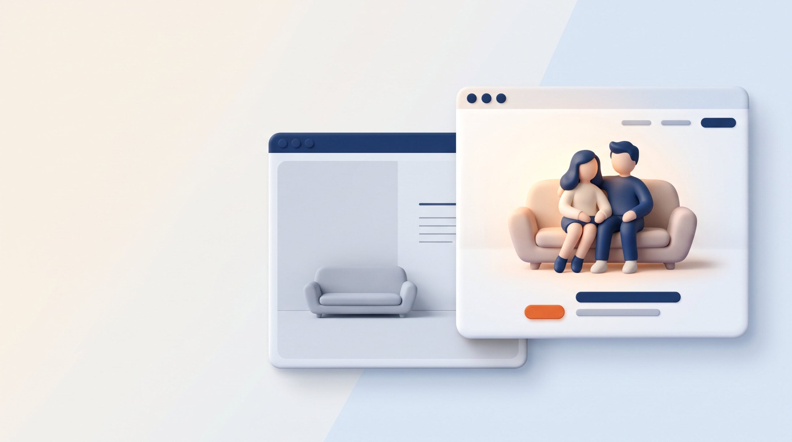

Good therapist website design often comes down to what someone sees in the first few seconds on a page. An Oregon practice’s couples page opened with a photo of an empty therapy couch. Our Google Ads strategist’s first notes were to replace the couch, shorten the top section, and add buttons throughout the page.
The rebuilt page, with new photos, new copy, and a shorter top section, converted 10% of ad clicks in its first 4 days, at $39.34 per conversion. Both leads booked. It’s an early, small sample as of Sep 22, 2026, and the credit goes to the whole rebuild. At William & Friends, we build landing pages for Google Ads around three first impressions: the photo, the button, and the video.
TL;DR
The top of a therapy page does a lot of work before anyone reads a word. Use real photos of your real office and clinicians, pick hopeful images that match the service, never use photos of clients, and on mobile put the image first, then the heading, the copy, and the button. Put a “Book a consultation” button in the header of every page so it shows up before anyone scrolls, word each button for its section, and test on both a phone and a laptop at normal zoom. Then add a short video, about 90 seconds, of a clinician talking in their own words, lightly edited, vertical for ads and horizontal for the page.
Key Points
-
Real people, real office. Skip empty rooms and stock photos.
-
Match the photo to the service. A couples page shows a couple.
-
Never use photos of clients. Staff and office only.
-
Image first on mobile. Then heading, copy, and button.
-
A button on the first screen. “Book a consultation” belongs in the header of every page.
-
Word each button for its section. Identical buttons everywhere are a common first-draft problem.
-
Let clinicians speak on video. About 90 seconds, in their own words.
-
Vertical for ads, horizontal for the page. Shoot with both in mind.
What the Best Therapist Websites Show on the First Screen
When you look through therapist website examples, the pages that work share a first screen (sometimes called the hero section) built from the same few pieces:
-
A real photo of a clinician, the team, or the office
-
A headline that names the service, and the city if you serve one area
-
A short line of reassurance, like who you help or whether you take insurance
-
One clear button, such as “Book a consultation”
-
A phone number for people who’d rather call
Everything else can wait for the scroll. The rest of this post covers the three pieces that make the biggest first impression: the photo, the button, and the video.
Therapist Website Design Starts With the Photo at the Top
The photo at the top of a page sets the tone for everything under it. Show real people, your real office, and your real clinicians, and skip empty rooms and stock images. Pick hopeful images that match the service: a couples page shows a couple, and a grief page shows something calm and hopeful.
People do respond to faces. In an experiment that replicated an online therapist directory, published in Psychotherapy Research, the faces in therapist profile photos influenced which therapist people chose, even after accounting for how trustworthy and competent each therapist seemed. Choosing a therapist is a decision about whether you can open up to a specific person, and the photo is often the first piece of evidence someone has.
Stock photos work against that. On one project, a client’s team said a brand draft felt “too stock” and much preferred the photos that were actually taken locally. On another, the practice’s only office photo had to be pulled from Google Maps. Good therapist headshots and a few well-lit office photos are worth budgeting for.
Therapist Headshots That Look Like You
A good headshot looks like the person a client will meet. Natural light, eye contact with the camera, and a relaxed expression go a long way. Keep the style consistent across your team so the page reads as one practice, and use the same current headshot on your website and your directory listings so people recognize the clinician they chose.
Never Use Photos of Clients
This one has no exceptions. HHS lists full-face photographs and any comparable images among the identifiers that have to be removed for health information to be considered de-identified. Keep every photo on your site to staff, your office, and your building.
Put the Image First on Mobile
Most people will see your page on a phone first, and Google uses the mobile version of a site’s content for indexing and ranking, according to its mobile-first indexing guidance. On mobile, the order that works best is image, heading, copy, button. The photo sets the tone, the heading says what the page is about, and the button is right there when someone’s ready.
Put a Button on the First Screen
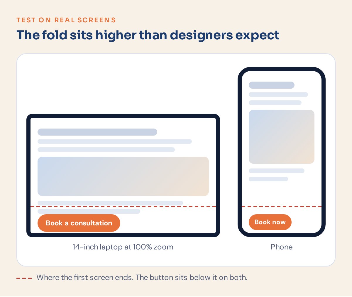
“Above the fold” means the part of the page you see before scrolling. On a therapy page, a booking button belongs there, on every page.
One client tested his own site on a 14-inch laptop at normal zoom. The booking button didn’t show, only the phone number. He asked for “Book a consultation” in the top bar of every page. In a different audit, no service page and no homepage had a button above the fold, and we called it the critical finding. That practice’s ops lead also said their sticky “schedule” button didn’t read as a real call to action. Missing buttons above the fold showed up in 2 of our recent audits.
This matters for ads too. Google’s advice on optimizing ads and landing pages says your landing page should mirror the call to action in your ad text. Google also describes landing page experience in terms of useful, relevant information, ease of navigation, and whether the page meets the expectations set by the ad. A clear button on the first screen covers several of those at once.
Word Each Button for Its Section
From our landing page checklist: “Six identical buttons is the single most common note on a first draft.” A button that says “Contact us” six times gives the reader no new reason to click. Word each one for the section it sits in, like “Book a couples consultation” under the couples section or “Meet our grief clinicians” under the team section.
Don’t send a “Find out more” button to your homepage, either. Someone who clicks it wanted more about the thing they were reading.
Test on a Phone and a Laptop
Check every page on a phone and on a laptop at 100% zoom. Designers often review on large monitors, and the fold sits much higher on a 14-inch screen than on a 27-inch one.
See how we build landing pages for ads Every service we advertise gets its own page, built around a clear first screen. See our approach to Google Ads for therapists.
Let Clinicians Sound Like Themselves on Video
A short therapist video on the landing page (sometimes called a VSL, or video sales letter) lets someone hear a clinician before they book. Aim for about 90 seconds, in the clinician’s own words. William’s advice to one owner: “The VSL should ideally be (somewhat) in your own words, as this is potential clients’ first touchpoint with you.”
We edit these lightly. It’s often someone’s first time hearing your voice, and a polished script read stiffly works against that. The owner said after recording: “The VSL turned out better than I thought it would.”
Shoot with two formats in mind. Vertical (9:16) video fits ads, and Google’s Shorts ad specs say vertical videos with a 9:16 aspect ratio are best suited for the Shorts format. Horizontal video fits the landing page itself.
We don’t have a trustworthy conversion figure for therapist video, and we’d rather not borrow one. The case for it is simpler: choosing a therapist is personal, and hearing someone talk is the closest thing to meeting them before the first session.
How to Shoot It
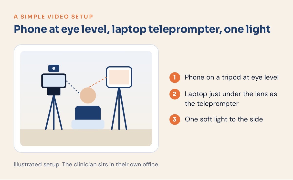
This is the setup from our shoot guide:
-
Phone at eye level, 4 to 5 feet away.
-
Laptop teleprompter right behind the phone.
-
One short line at a time: read it, say it to camera, pause.
-
Two full passes of every script.
-
Turn off every light except the one on you (William’s tip).
More on showing up as yourself If putting yourself on camera feels awkward, start here. Read how to market yourself as a therapist without the sleaze.
How to Tell Whether Your First Screen Is Working
The rebuilt couples page we opened with is the example we’d point to. New photos, new copy, and a shorter top section took it to 10% of ad clicks turning into conversions in its first 4 days, at $39.34 per conversion, and both leads booked. The sample is small and early, and the photo didn’t do it alone, since the copy and the top section changed too.
Measure your own page the same way: how many people who land on it submit a form or call. If that number is low, start with the first screen, because it’s the part every visitor sees.
Frequently Asked Questions About Therapist Website Design
What should a therapist website include?
At minimum: a page for each service, a page for each clinician, fees and insurance details, a clear explanation of how to get started, plain-text FAQs, and a short contact form with crisis information above it. Put a booking button in the header of every page so people never have to hunt for the next step.
What makes the best therapist websites stand out?
Real photos of real clinicians, a first screen that says what the page is about, copy that sounds like the practice, and a layout that works on a phone. Above all, a nervous first-time client should be able to tell, within a few seconds, that they’re in the right place.
Can I use stock photos on a therapy website?
You can, and real photos usually do more. People choosing a therapist are trying to picture a specific person, and one client’s team told us a stock-heavy draft felt “too stock.” Invest in current headshots and a few office photos, and never use photos of clients.
Should therapists put a video on their website?
A short video, about 90 seconds in the clinician’s own words, gives people a chance to hear you before they book. Keep the edit light, shoot vertical for ads and horizontal for the page, and keep it sounding like a conversation.
8 First-Screen Rules Every Practice Owner Should Know
Use this as a quick review of any service or landing page.
-
Real photos: your office, your clinicians, no stock.
-
Match the service: a couples page shows a couple.
-
No clients: never, in any photo.
-
Mobile order: image, heading, copy, button.
-
Header button: “Book a consultation” on every page.
-
Specific buttons: word each one for its section.
-
Test two screens: a phone and a laptop at 100% zoom.
-
Short video: about 90 seconds, in the clinician’s own words.
A page that gets these right tells people who they’ll be talking to before they’ve read a paragraph.
Conclusion
Therapist website design is mostly about helping someone picture sitting across from you. A real photo, a clear button, and a clinician’s voice do most of that work.
At William & Friends, William Turner and Carlos, our Brand and Creative Director, work with behavioral health practices on exactly these pages. We only hire people with experience in behavioral health, and we build every page around real photos of real people.
Start the conversation If your pages aren’t turning visits into consultations, let’s talk about your practice. We’ll use the call to see whether we’re a fit, and if we’re not, we’ll say so. Book a fit call.


